Final Music Video

Below is our final music video, album cover and official band website.

Website

Album Cover

Album Cover

Wednesday, December 15, 2010

Q4. How did you use new media technologies in the construction and research, planning and evaluation stages?

Throughout our project we have both used new technologies and software, as well as expand our knowledge of technologies used in previous projects. The following are the key advancements I have made in my uses/knowledge of the media technologies.

Research/Planning:
  • Camcorder for test shoot of lip sync and location reccie
  • Web 2.0. and social networking sites for audience/industry research (e.g. YouTube)
  • Blogger to present the presentation to the class and teacher, showing all our references and ideas
Production:
  • Stills camera (particular new technique of burst mode to capture 'action')

This shows the effects that can be gained using burst mode. We used this for the back cover of our album cover, instructing the actors to run towards the camera throwing confetti, thus creating the mid-action shot we used.
  • HD footage
  • Studio light (floor lamps, laptop to control head lights)
  • Here I am filming the band. The floor lights are lighting them individually, while the studio lights controlled using the laptop light the overall set
    Adobe Premiere Pro for editing (new techniques learnt in rotascoping/colour correction)
This film demonstrates the key processes we learnt and went through when editing our music video.
  • Illustrator to design the logo
This is the development of our logo. We made it look neater and sharper using the tools of illustrator so the image would look clear on any merchandise/website we placed it on
  • Playback when filming in the studio
  • Photoshop for the album cover
We used guidelines for an actual digipack to ensure when printed our images/text were the right size. We then had to use bleed lines as when it prints, it may cut/add to these guides. Photoshop worked well as we could also edit the photos to enhance the lighting and colour depth to make the album cover stand out and look professional
  • Wix.com for designing the website
  • 
    On wix.com I learnt how to create a flash website, adding in all the features of a bands official website (e.g. links to facebook, music video, music player, links to different pages)
    
  • Burning the DVD to hold a screening
This is me when in directing role - filming with the HD camera, panning using the tripod and instructing the antagonists as to how to move

Q3. What have you learned from your audience feedback?

Screening:
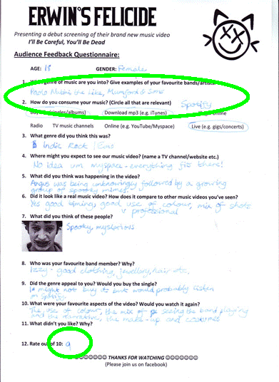
We filmed the premiere screening of our video, showing it to a range of people from our target age range of 15-20. After watching it through a few times, we recorded their opinions on questionnaires.


Audience Interview:
We selected two random members of our audience screening and filmed an interview to gain more indepth reponses.


We found:
(Table charts referenced from Dominic Crewe)
  • 50/50 male and female audience questioned, aged 17/18
  • Appreciation the music, instruments and playing ("soft spot for the drumming")
  • Of the ones who had similar music genre taste (indie/rock) they believed the band worked well
  • High level of understanding in the narrative (imaginary characters, running away)
  • Consensus of seeing music video on rock channel Kerrang!
  • Narcissitic pleasure from the girls of Izzy's clothing and from the boys of Angus
  • Sexual gratification from Tom's appearence and role in the music video


Our target audience (and how its changed from the start of the project):

Original TAActual TA now
16-2416-20 (greater focus on the teenage audience
Predominantly masculine Equal both genders - sexual gratification of Tom and narcissism of Izzy
Love of live music/finding new musicSame
Artistically culturedSame - appreciate the sites such as Rough Trade in video
Techo savvy (social networking sites)Comment on/discuss band on Facebook/Twitter
Be in a band of their ownLiked the instrumentals in the video
Indie/emo music tasteBroader - metal/rock/indie/emo fans all enjoyed the music and visuals
Individual style in clothesSame
Politically/socially activeSame

OVERALL - a broader target audience in terms of music taste and style, however more niche in terms of age range

Q2. How effective is the combination of your main product and ancillary texts?

Here we took on the roles of managing directors of Live Records ltd. who have produced Erwin's Felicide. We therefore analysed our choices of website, album cover and music video in context of their branding to audience and potential revenue that could be gained.


Detailed Website Evaluation:

  1. Used a common font (Bicycle) for the band's title to enhance branding. We chose the font as it was a clear, legible font (good on t-shirts/merchandise) however also appropriately spikey and different to suit the genre
  2. The music player consistently plays while the viewer browses the pages to promote both the current album's tracks and the new single Like a Drug
  3. Links to social networking sites (FaceBook, Twitter and YouTube) creates a fanbase with our techno-savvy audience and keeps the site interactive
  4. Consistent use of the logo with the orange/navy/black/white colourscheme strengthens the brand identity
  5. Informal, chatty style of 'talking' to our audience reduces the space between them and the band - makes them feel they are on friendly terms
  6. Constant music references as our audience may like finding out about the band but the music is always keys (instruments, headphones etc)
  7. Copyrighted by the record company Live Records creates a symbiotic relationship - the band promotes the label and vice versa
Detailed Album Cover Evaluation:

  1. Consistent use of the logo with the orange/navy/black/white colourscheme strengthens the brand identity
  2. The theme of our album cover is party related - the party streamers shows the band having fun/lighthearted nature
  3. We use burst mode to create this mid-action style photograph, so the shot looks action packed and exciting
  4. The Live Records logo
  5. We used a consistent font for all the text on both our album cover and website (UWCH), which is a clearly legible yet sketchy/trendy font
  6. The small print maintains the copyrights of our band being owned by Live Records, as well as directing our audience to the bands website
  7. The spine is in the regulation font and style, with reference to the live records and bar code
  8. We wanted to convey a sense of friendship and closeness in the front image - so our audience would want to know the band - which is helped by the brightly coloured tshirts/shoes

Q1. In what ways does your media product use, develop or challenge forms and conventions of real media products?

As a group we filmed our discussion into the key forms and conventions within our music video. We focused on the music video analysts Goodwin and Vernallis as well as the film theorist Levi-Strauss. Then we looked into all the real media products we were inspired by, developing their conventions, as well as the ones we differed to in challenging the forms.

The video shows visual representations and references of our discussions.

When completing the music video, we are focusing on creating as many of binary opposites as possible. This is because in a music video, it must be as visually exciting as possible. Binary opposites allow this to happen as we create the extremes and place them next to each other to keep our audience hooked.
Inside/Private/Empty
In the studio
Outside/Public/Crowded
In London
Smart, styled clothes
Waistcoat, tie, shirt

Casual, everyday
 T-shirt, trainers
Fast-paced editing
Slow-paced editing
Black and White
In performance
Colour
In narrative/Angus's costume
Still cameraCamera movement
CU/BCU/ECU
On band in performance
Wide/LS
In narrative and of studio
Reality
Band/music in headphones
Fantasy
Antagonists

Sunday, December 5, 2010

Social Networking Sites

We've set up a Facebook, Myspace and Twitter page to enhance the level of interactivity our techno savvy audience can gain. We will link our website to these pages so that the target audience can also discuss on forums with each other

Wednesday, December 1, 2010

Editing

Editing is still going really well, we've got the basic clips down

To make it more original we've learnt about this process called rota-scoping and colour pass. It makes it look really professional, and I don't think it'll take too long.

Nearly finished on the product! :D

Monday, November 29, 2010

Behind the Scenes


Here is a behind the scenes look at our narrative shoot in london. When making the video, we looked up other similar behind the scenes films of other music videos to make it look genuine. We instructed Angus to play in character as the rock star on the set of his debut music video.

Monday, November 15, 2010

Photoshoot

Today we did our band photoshoot for the album cover.

When deciding how to pose our band we researched bands of a similar genre. Particularly inspiring was the tongue-in-cheek style of the indie band Danananananaykroyd.


I learnt:
  • How to set-up the photographic lights to flatter the actors and avoid shadows
  • Use the 'reverse' option on the camera to create a stop-motion effect
  • Encouringing my actors to laugh/interact to create natural looking shots
The shoot went very well and we achieved getting:
  • Group shot for the front cover
  • 'Party' shots for the inside
  • Individual promotional shots for the website

Monday, November 1, 2010

Band Names

After a group discussion today, we have come up with ERWIN'S FELICIDE as our band name for the following reasons:

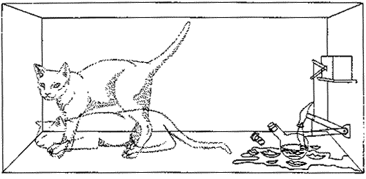
  • Inspired by the scientific/philosophical problem of shrodinger's cat
  • Felicide connotes death (a key theme of the emo genre) but is more subtle
  • Erwin was Mr Shrodingers first name

Friday, October 22, 2010

Storyboarding

Storyboard
  • The timings of our music video
  • Serves as a reminder to us of what specific shots to shoot and to give our actors a general idea of what we want them to do
  • Showed us how many shots we needed
  • ANNOTATIONS ON REVERSE OF POST-ITS so we could order shots/put in length of shot
Storyboard - On wall behind edit suite
 Wanda put the effort into drawing the Post-Its because of her artistic abilities but we had all previously worked out generally what we wanted to happen and when.
 
The purple represents narrative shots and the green performance to we could create an even balance of the two. At this stage we are still planning where to place all of the performance shots, as the narrative shoot is our priority
 

Example CU of the performance/narrative sketches and the timeline in 5 second increments
In pairs we went around London to film a reccie to get shots for the storyboard
  • We practised setting up a shot in a crowded areas and instructing actors from a distance
  • The movements of the antagonists
  • Listed all the shots we would attempt on the day
  • Timed the different journeys to make the most effecient plan for the day
  • We could then use these shots to explain to all our actors what was required on the day, to cut down directing time on the day
When we got back to school, Dom spent a week overcoming technical problems to edit the footage into this.

Tuesday, October 19, 2010

Album Cover Initial Ideas

Initial discussions/plans/personal ideas for the future of our album cover:
  • The barcode idea is meant to be ironic as our audience/band are anti labels/branding, as individuality is vital
  • I believe it will look effective as an album cover as the band's image is on the front (because its a debut band), but its not a convention of the genre so the subtlety will prevent the audience from being put off
Improvements:
  • Replace the cartoon with a black and white image of the band - need to think of iconic, memorable image
  • Add a colour album title to the top left to liven it up
  • Change the 'I' in the name to '1' to make it more obvious that the title is where the numbers are usually
  • Think up song titles for the back cover
  • Add more colour to rest of the album cover to prevent it looking monotone
  • I think a BLUE and ORANGE colourscheme would suit our band as it follows Angus's costume, and it breaks normal boundaries to look arty and different

Monday, October 18, 2010

Need to do before Half Term

The narrative shoot is in half term (next week), so before it we need to get done the following:
  • Finish detailed shot list
  • Storyboard
  • Scheduele the day
  • Practice the antagonists face paint
  • Complete the antagonists costume
  • Confirm Angus's costume
  • Have meeting with all actors showing them the shots we need to get on the day
  • Finalise with all cast and crew (Group x4, Angus, Antagonists x4, Tess, Robyn, Zarah) the exact times and arrangements of the day
  • Plan food preparations for the day (snacks, drinks, lunch for the cast/crew)
  • Organise make-up/hair stylings for the actors
  • Get all filming equipment ready to go

Other:
  • Group discussion on website
  • Group discussion on album art/ideas
  • Confirm studio for performance
  • Confirm Angus and Tom's costumes for performance
  • Ideas on band photo for album cover - and costume/props needed

Saturday, October 16, 2010

Location Reccie 2

Today we went as a group to each of the narrative locations to plan/practise/film actual shots needed for Angus and the Antagonists on the day.

Kerry and I did the morning and achieved:
  • Found locations on the South bank
  • Found the ending scene location @ Westminster where Angus gets cornered
  • Filmed possible shots in Westminster station
  • Filmed locations and shots in Trafalgar Square, Leicester Square and Covent Garden
  • Timed how long it took to get to each location
  • The trains were also cancelled on many lines, so we found an alternative walking route
  • Filmed shots for the actual video - opening shots of London (St Pauls and Piccadilly circus, to add in motion blur)

Thursday, October 14, 2010

Personal Costume List

From the costume needed, I've made myself responsible for bringing the following:
  • Blue tights
  • Black/gold skirt
  • Purple heeled boots
  • Black shirt
  • Beaded necklaces
  • Back-up tights
  • White/red/black facepaint (to order)
  • White hair spray
  • White shirt x2
  • White braces

Tuesday, October 12, 2010

Website planning

Due to a background and knowledge of HTML coding, I've volunteered to produce an official website for one of the ancillary tasks. The group will input on the content/styling of the website, meaning I plan to create the basic coding and formatting over half term.

Initial notes on what is needed:
  • A theme (related to the album cover art running throughout on the background, icons, etc.
  • Photographs and videos of the band such as the music video, behind the scenes, our competition, wallpapers, etc.
  • One or more media players to show the videos or perhaps a slideshow of pictures.
  • Opportunities for the audience to buy into the band such as a merchandise store or a link to their iTunes.
  • Ways for the audience to communicate with the artist such as a comments section, social networking sites, e-mail button, forum and so on.
  • Information about the band / individual band members (which would really work with our idea to give each member a different 'scene')
  • Details of upcoming performances (at small gigs around London, e.g. Covent Garden, "Rough Trade")

Thursday, October 7, 2010

Key References/Inspirations

These are the key sources we used in intial discussions as well as personal thoughts on what to put forward to the group

Past LatymerMedia project: Delirium - Touch Me
  • Creates the visual look and feel of the London club scene at night
  • We are attempting to provoke the same emotion in our audience be recreating the visual look and feel of London's daytime indie scene


Past LatymerMedia Project: The Sporadic - Cubicle
  • Following lead running through London creates a fast paced, visually exciting video
  • The audience gain pleasure from recognising the famous London sites
  • Our audience will feel proud to know the niche indie locations (e.g. Camden/Roundhouse/Brick Lane)


Green Day - American Idiot


  • We were inspired by this video to attempt to use strobe lighting on the performance side of the video
  • We tested this out and it worked well but it is very hard to get right so decided to have it as a possibility but not rely on the idea

Tuesday, October 5, 2010

Website Research

Death Cab for Cutie are an internationally acclaimed indie rock band. There last album was released around 12 months ago and their site was updated to market it to their global audience.


Institutions:


  • Atlantic Records is an international company that specialise in promoting indie/alternative bands
  • They have seperate organisations within each section of the world to specialise to the needs of different countries and audiences
  • Getting a well known graphic designer in to promote their website shows the importance in artistic expression to the band and their fans
Functions of the website:
  • Promotes bands music, tour, fan club, merchandise etc. creating a source of cheap marketing and revenue
  • Creates and evolves the bands cultured, artistic brand identity background
Brand identity and construction:
  • Mainstream alternative/indie rock band
  • Appeal mainly to teenagers but the relaxed, subtle sound to their music means the sound can appeal to older audiences as well
  • The website have a simplistic colourscheme and style to prevent looking too extreme, however their artistic side is shown throuh a well thought out structure, animations and visual images (e.g. the radio/photos)
Target audience and audience appeal:


Feature of Target AudienceAudience appeal on website
Mostly teenagers (15-24) who, despite being alternative, want to gain a strong image identity from the music they listen tooLots of image merchandise sold (e.g. clothes, accessories) and a focus on symbols of the indie crowd (e.g. retro radios/instruments)
Both genders - audience not contricted by societys rules on gender (e.g. in appearence and actions)Orange colourscheme appeals to both genders as well as having band photos that provides style for the males and audience photos focusing on the girls
Enjoy the live concerts and atmosphere of meeting fellow fansPhoto section mainly includes pictures of intense live gigs, showing both the band playing and the audience's reaction as well as having an 'official' fan base for the fans to meet/chat with each other

Marketing strategies:
  • Sell to the digitally savvy audience through the creation of an iPhone app
  • Focus on the blog where the audience can create a personal relationship with the band
  • Fanbase creates word of mouth - free, lucrative marketing strategy
  • The website provides great promotion for the band with international reach and maintaining a small marketing budget
Opportunities for the audience to buy into band:
  • Links to the online store: http://store.deathcabforcutie.com/ where you can buy the albums/singles, clothes with the band logo on etc.
  • Join the DCFC mailing list where emails about price reductions/competetions are sent
  • Link to buy the DCFC iPhone app where news of upcoming tour dates/music release is posted
Importance of othre media:

  • Digitial radio and magazines - provide a source to gain new listeners and their previous good reviews are good below the line marketing

  • The internet - main source of marketing - free and provides reach to a sporadically placed international audience

  • Live performance - they promote their atmospheric live gigs and concerts where they gain revenue and appeal to their audiences needs and wants

Pitch of Treatment to Class/Teachers

We have prepared a treatment to pitch for feedback for our ideas, covering:
  • Band identity
  • Target audience
  • Ideas for the narrative/performance of music video
  • Ancillary task ideas (website and album cover)
  • Marketing strategy
These were the handouts we gave out to go with our group proposals:

Treatment (C,D,K,W)

Feedback (Claire and Wanda):
  • Liked the band name
  • Having a girl in the band creates a good USP
  • Headphone shots with book-ends works well
  • Re-evaluate ideas for the antagonists - possible change colour and style? No hoodies
  • Confirm exactly what the meaning behind the album cover ideas are

Monday, October 4, 2010

Target Audience


Core target audience:
  • Aged 16-24 mainstream indie/alternative scensters
  • Music is their life - read magazines (Kerrang!/NME), enjoy discovering new bands (MySpace/YouTube), discuss lyrics/artists with friends, live gigs concerts with atmosphere
  • Look to music for identity - clothes, political statements, iconography
  • Specialise into specific style - emo/punk/indie - look to make this style their own but recognisable
  • Both genders - audience not defined by societies rules on gender
  • Artistic and cultured - appreciate the 'icons' of the indie scene (e.g. concerts halls - Roundhouse)
  • Techno-savvy - use internet blogs/forums to discuss, download tracks (iTunes/Spotify), find bands online (Facebook/websites)
Moshers:


Indie Scenesters:

Friday, October 1, 2010

Location Test

Today we did a reccie of London as a group to look for good indie scenes as well as specific locations for interesting shots. We believe the photos look vibrant and colourful, despite the fact the weather was dismal, cold and wet so we are hopeful that the conditions on the day won't affect our project. The crowds however made it difficult in some places.

Here is the best of what we shot that day:


Result:
  • Found the London Underground meant that filming in North/East/South/West is practical as it took minimal time to travel
  • Gained photos of all locations we intend to use (recognisable features e.g. the Globe/the Barbican/the Roundhouse and suitable places to shoot)
  • In a group meeting to open the day we simplified the idea of the antagonists narrative as London is visually complicated as it is